Three Interactive Data Maps Data-driven, Interactive & Animated If you’ve ever spoken to onto the DL team about a project there’s a fair chance we’ve tried to get a map

101 Data Visualisation Resources Ideas, inspiration blogs, people, tools and more! We’ve searched and searched to bring you 101 links to some of the best things in the data design and
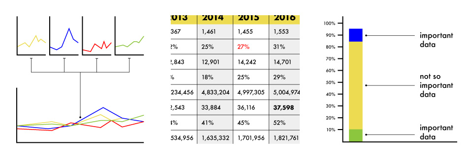
3 Alternatives To Using A Data Table Stop using tables. Seriously, there are better ways to show data. Here are three: When we run our data visualisation workshops we run an
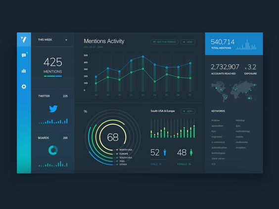
3 Pro Tips for Great Dashboard Design A strategic approach to visualising your data through dashboard systems for humans. Here at Datalabs, we eagerly await the day computers gain sentience,
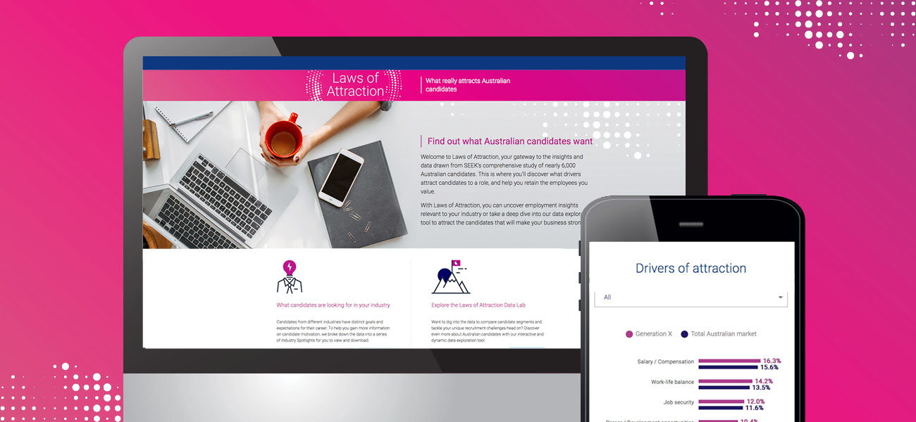
SEEK Laws of Attraction Find out what Australian candidates really want What attracts people to apply for a job or work for a company has changed. Where salary and job
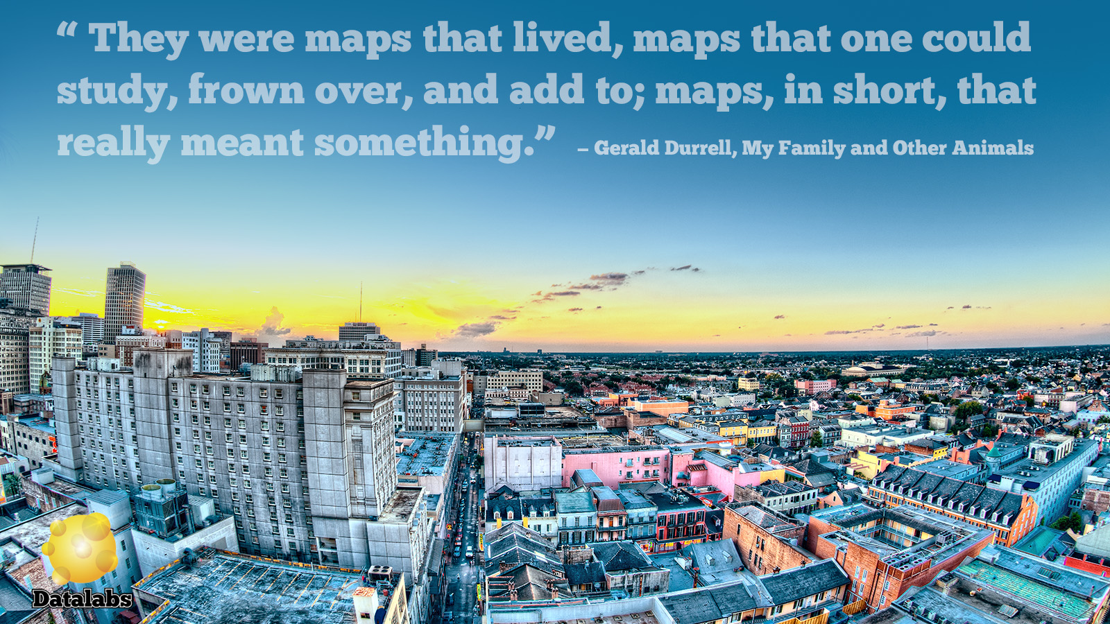
Data Stories and Map Design A look at how maps can help tell your data story Humans have used maps to share information about the world around us for over

Al Jazeera Infographic Workshop Case Study 2 days with Al Jazeera Journalists, Producers & Designers talking about infographics, data and process. Where: Onsite at Al Jazeera HQ in Qatar
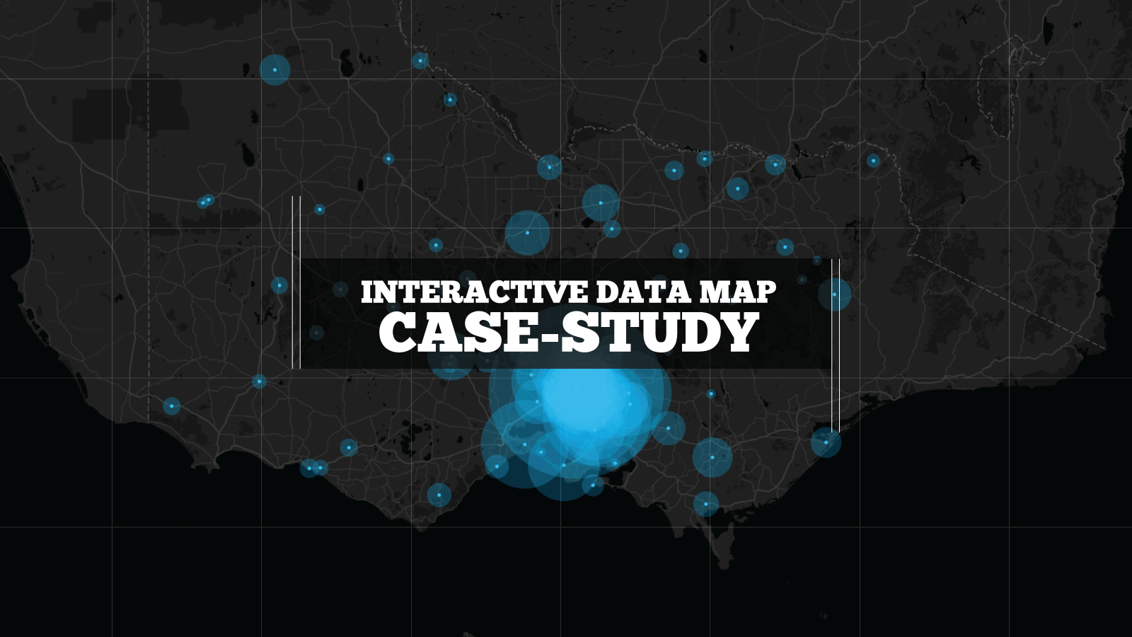
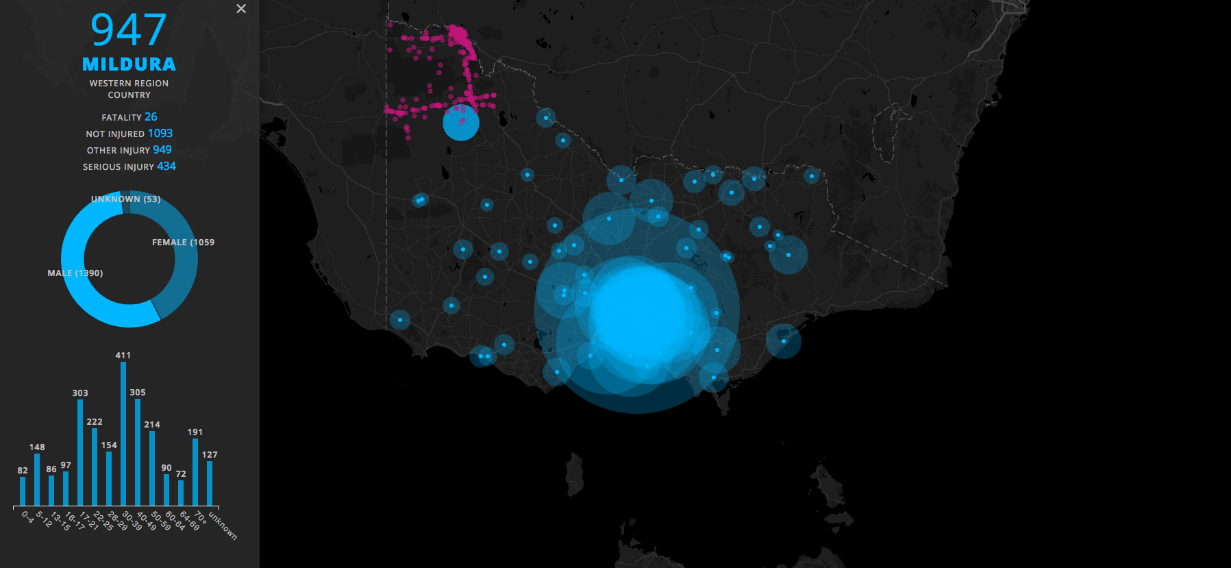
Interactive Data Mapping Case Study The interactive map is designed with d3 and Google Maps API Pulls data from ABS traffic accident data Interactive map combined with data visualisation Who:

What Makes A Great Year in Review? A list of our most favourite digital annual report content elements for 2017 Almost everyone produces a Year-In-Reivew and most of those still get
Copywriter & Data Journalist – Melbourne Datalabs is looking for a Data Journalist with experience in interpreting content and data into simple stories for use in our agency’s infographic reports, animated