

A primer.
In today’s technologically advanced age, we are overwhelmed with data everyday – not all of it necessarily useful. Having a hold of data is treasure, but what is treasure if you can’t invest on it?
The process of data visualisation aims to make sense of information, which in turn can be used to shape and direct future decisions. Molding that information into something comprehensible and legible can be difficult, requiring precision and analysis that comes with experience and general know-how.
So you want to dive deep into the data viz world – where to start? Let’s break it down into its simplest elements, shall we.
What’s a dashboard?
In a nutshell, a dashboard displays aggregated information in a visual and digestible way. There are three types of dashboard reports:
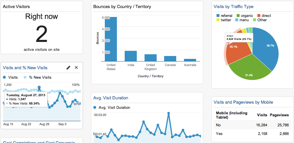
- Operational dashboard: This type of dashboard is used to monitor a business process and track its performance against a set Key Performance Indicators (KPIs). Its data changes frequently, sometimes on a minute-by-minute basis, and is designed to be viewed multiple times a day. An example is Google Analytics that tracks website traffic.
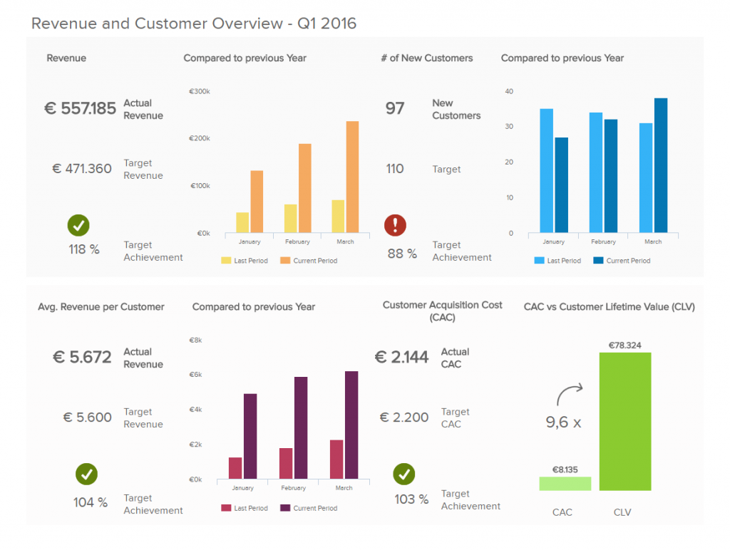
- Strategic dashboard: Strategic dashboards are often used by C-level executives to track the status of the organisation against KPIs. Updated on a recurring basis, it gives an overview of the business’ top-line performance in one neat page.
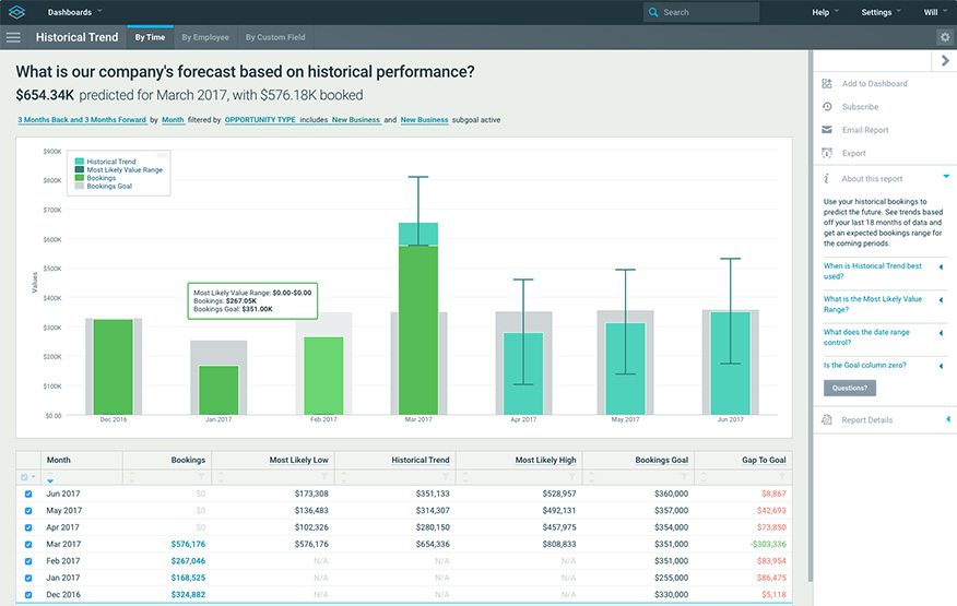
- Analytical dashboard: Analytical dashboards are smart. They analyse large volumes of data, allowing its users to forecast future trends and discover insights. An analytical dashboard is a powerful reporting tool, meant to help organisations make better informed, data-driven decisions based on insights into historical data. This type of dashboard can often be found in business intelligence tools, typically designed by seasoned data analysts.
Different types of charts – and how to use them
A dashboard is made out of charts of various types, each has its own use cases. Think of a chart like a canvas – the right one can enhance your data, depending on what sort of message you want to convey. Below is a general guideline for different chart types and its best practices.
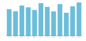
- Column chart – used to show comparison over time or amongst different items. It is simple, succinct and to the point. Use consistent
colours throughout the columns to avoid confusing readers,utilising accentcolours to highlight meaningful data points. To reflect the values appropriately, start the y-axis at 0.
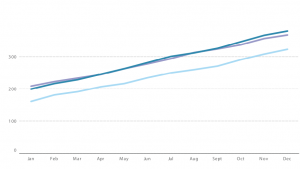
- Line graph – a line graph reveals continuous data, showing trends and progress over time. Multiple data sets can be shown through different plots, differentiated through contrasting coloured lines. Avoid having too many data sets/lines as it can be confusing to read.
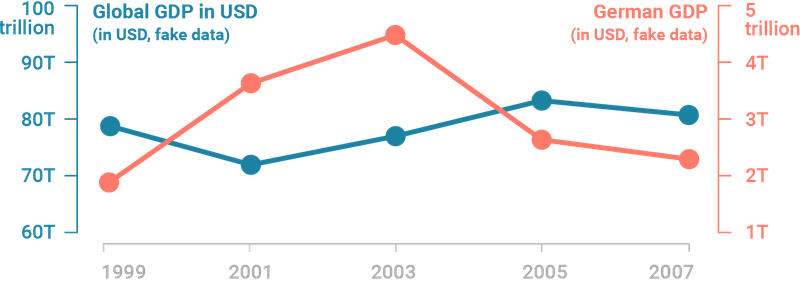
- Dual axis chart – think of dual axis chart as the love-child of line and column charts. This type of chart allows you to plot based on two y-axes figures and a single x-axis, meaning you can visualise a correlation – or lack thereof – between three data sets. For best practice, use contrasting colours and different graphic styles between data sets to distinctly differentiate them.
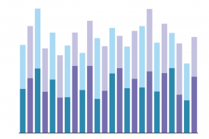
- Stacked bar chart – a cousin of the column chart, stacked bar charts are like a column chart, with the addition of showing the variables that make up a column. This illustrates a part-to-whole relationship for each data sets over time. Use contrasting colours for each variable for clarity.
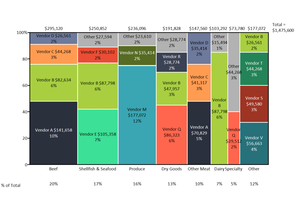
- Mekko chart – a mekko chart, also known as marimekko chart, is similar to a stacked bar, except the x-axis can capture numerous dimensions, rather than just a progression of time. Each bar can contain multiple composite values. For best practice, use a colour gradient for each stacked bar to represent its correlation to one another, and organise placement of sets in such a way to expose a relevant trend.
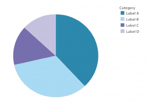
- Pie chart – who’s never heard of a pie chart? Pie charts are best to show how categories represent part of a whole –
a 100 %. For best practice, ensure that all slicesadds up to 100% and segment slices according to their size. Avoid illustrating too many categories to ensure differentiation between each slice.
—
Phew – not too complicated is it?
To get started on your data viz journey, it is important look at the data present and