

5 Captivating Information Visualization Examples
Beyond Infographics, Charts & Graphs
Thanks to the ubiquitous infographic, most people are well-acquainted with information visualization. But infographics aside, we believe the field of information visualization remains relatively unexplored.
Infographics are just the of the iceberg. Leaps and bounds in digital technologies have opened up literally thousands of applications for visualization, from the corporate world, to the science, education and social change sectors.
We’ve curated this list of 5 truly captivating examples of information visualization to help inspire a more imaginative approach to this exciting field.
Information Visualization #1
Augmented Reality Animation
Hans Rosling’s famous lectures combine public data with a sport’s commentator’s style to describe our past, present and future. In this “Joy of Stats” video, he uses augmented reality animation to overlay real-world footage with sophisticated visualizations to help tell the story of the world in 200 countries over 200 years using 120,000 numbers – in just four minutes. This is public education at its best.
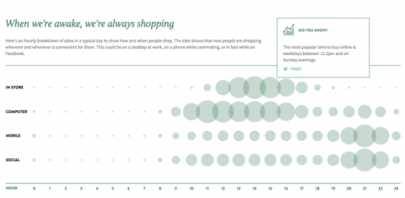
Information Visualization #2
Interactive Infographic

Information Visualization #3
Creative Campaign

This clever campaign by Australian advertising agency Leo Burnett for the World Wildlife Fund aimed to raise awareness not just of illegal poaching, but of the larger industry supporting the slaughter of endangered animals. With an approach that straddles art, advertising, and information visualization, the Stop One. Stop Them All. campaign vividly illustrates the concept of a supply-chain, without sacrificing emotional impact.
Information Visualization #4
Annual Reports
The Annual Report should be an opportunity rather than a burden. Shopify’s 2014 Annual Report is online, visual and interactive, seizing the opportunity to enthuse shareholders and potential investors, rather than bore them with a text-heavy report.
Information Visualization #5
Scientific Simulation
This stunning video by NASA visualizes carbon dioxide (which is actually invisible) swirling around in our atmosphere. The simulation took 75 days to create on a supercomputer at NASA’s Goddard Space Flight Center. Its superhigh-resolution mapping is 64 times as great as the average climate model and shows that massive amounts of carbon dioxide are absorbed seasonally by forests and other vegetation. In this case, visualization transforms the movement of carbon from something rather dry into something quite mesmerizing.