

Brilliant Examples of What Tableau Can Do
A list of the best dashboards we’ve found on the web.
Tableau is a data visualization tool making it possible for just about anybody to create interactive, real-time dashboards, infographic reports and amazing data charts. With the launch of Tableau 9.0 earlier this year, the data dashboards are making leaps and bounds into the mainstream.
In any sector you can name, there is a need to capture and analyze data, but historically, data dashboards have been out of reach for most organisations. Tableau changes that by making data visualization non-technical and affordable. With features that include interactivity, filtering, highlighting and the ability to combine multiple data sources, there are millions of ways this technology can be used. To celebrate that fact, we’ve tracked down real-life examples of Tableau dashboards in the wild.
Finance Tableau Dashboard
CNBC’s History of the DOW 30
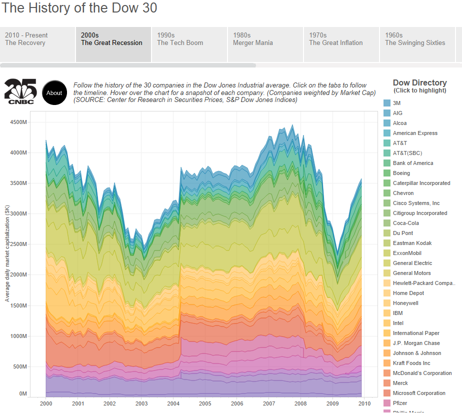
Drawing on an incredible database, this dashboard tracks the performance of the 30 companies in the Dow Jones industrial average, over the last 100 years. Booms, busts and recoveries are mapped in plain sight, and the dashboard makes it possible to view the data decade by decade, or to isolate individual companies.
Social Media Tableau Dashboard
Tapestry Data Storytelling Conference 2014 on Twitter
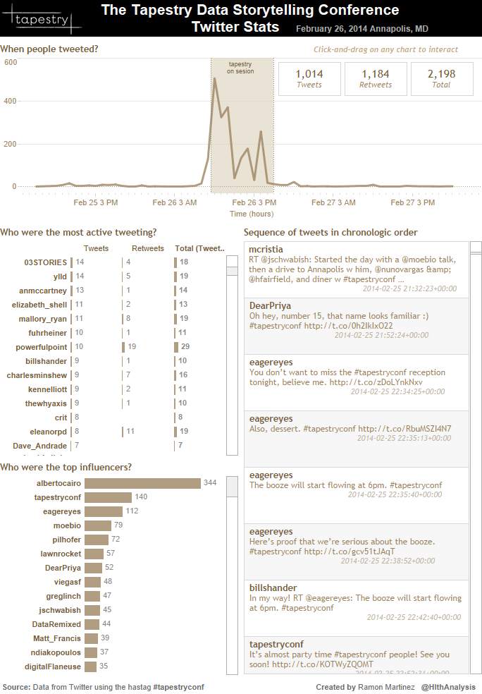
At the Tapestry Data Storytelling Conference, keynote talks and short story presentations were captured by over 2,100 original tweets and re-tweets published during the sessions. Ramon Martinez of Health Intelligence used Tableau to create this simple but instructive twitter dashboard to chart the conversation. His dashboard is simple but instructive, and demonstrates some of the many ways that social media activity can be visualized using Tableau.
Energy Sector Tableau Dashboard
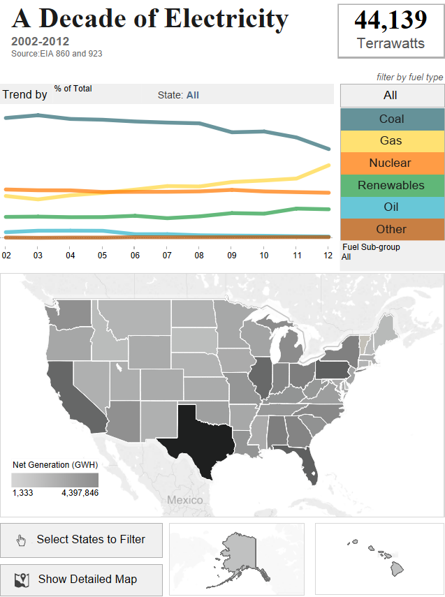
EIA Data on Energy Generation 2002-2012
Real Estate Tableau Dashboard
Zillow’s Data Dashboard
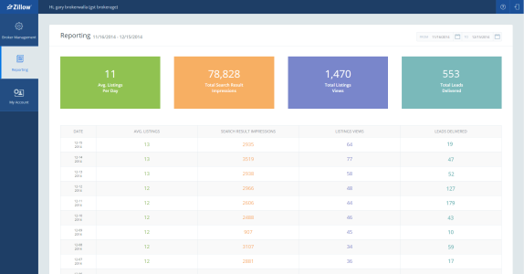
Real Estate company Zillow recently launched a new platform to improve the accuracy of listings and give real estate brokers access to better reporting tools. The Zillow Data Dashboard is built on Tableau and demonstrates how powerful the software can be in the hands of experts. Zillow’s dashboard enables single-click publishing of real estate listings, automatic updates to listings every 15 minutes and daily reports for brokers to track how listings perform.
Government Services Tableau Dashboard
United States’ Food Stamps Program Analysis

This fascinating dashboard captures data on the benefits available to people on the United States’ Supplemental Nutrition Assistance Program (otherwise known as food stamps). Built by Anya A’Hearn, it was inspired by Panera CEO Ron Shaich, who spent a week trying to survive on the SNAP food and beverage budget of $4.50 a day. The dashboard not only helps users understand the demographics of those on the Program, but allows them to manipulate the data to see what their family would receive if they ever needed food stamps — a powerful way to communicate important data about government services.
Tableau has opened new doors, making it possible for all kinds of organizations (not just the Fortune 500) to produce the kinds of data visualizations that inform and drive smarter decisions. Although there are great examples of Tableau dashboards out there (the six featured in this post among them), it’s still very early days. We’re excited about the possibilities for Tableau to help people in all sectors produce some stunning, game-changing dashboards. Watch this space.
Want a dashboard of your very own? Click below:
