

7 Killer Microsites & Interactive Web Design Experiences That Will Inspire You!
Microsites, journey maps, timelines, stories and interactive data tools!
If a good infographic tells a story, then an equally great interactive data visualisation is an experience that allows the user to dive into the data to create their own experience, by getting to ‘play’ with the data, or going on a guided interactive journey.
For those that are curious, a microsite is a smaller or auxiliary website, often contained within another site, that exists for a single or targeted purpose. For example, sustainable annual reports (like the ones we make here) or to house a report like (this one we made for Finisia).
In no particular order, here are our favourite interactive microsites at the moment.
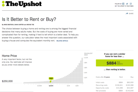
Rent or Buy? – New York Times
It’s a simple data tool designed to allow the user to plug in relevant data about their circumstances, and calculate if it’s better to rent or buy property according to their current and projected state. This one might not be the most visually impressive one on the list, it does take a lot of data and convey it very, very clearly within a simple and highly usable interface.
All About Fonts
An immersive microsite about typography tells a story with a timeline, and an absolutely amazing set of transitions between the spaces as part of the journey. Clean, simple and really, really cool.
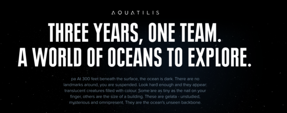
AQUATLISIS

is a deep sea and aquatic environment exploration yacht. This microsite documents the journey and show some amazing stories that were captured over the journey. It uses a simple top-to-bottom scroll, with highlights and ‘read more’ options as side tabs, as well as animated maps, counters, animated micro-infographics & charts. Clever flow allows the main story to be told simply while allowing the user to get more info when needed – a nice work around when you want to balance text and flow.
Rome – “3 Dreams of Black”
An interactive music video – this one’s best experienced with a browser and headphones.
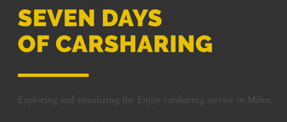
7 Days of Car Sharing
A beautiful and clear data story about how the fictional car sharing service ‘Enjoy’ might be visualized and presented as a week’s worth of journey data. It uses interactive charts to convey a huge data set clearly and efficiently. It uses interactive/animated maps with the d3.j’s library, to show how the service covers the city and let the user find their own relevant story in the data.
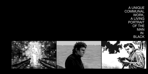
The Johnny Cash Project
A microsite that allows artists from around the world to share their portraits of The Man In Black that will be combined into a music video. Beautiful animations, lovely user experience and of course lots of black…