
6 Examples of How Best To Visualize Net Promoter Score Love it, hate it (or neither…) – Net Promoter Score (NPS) is a key success measure in countless businesses across the world.
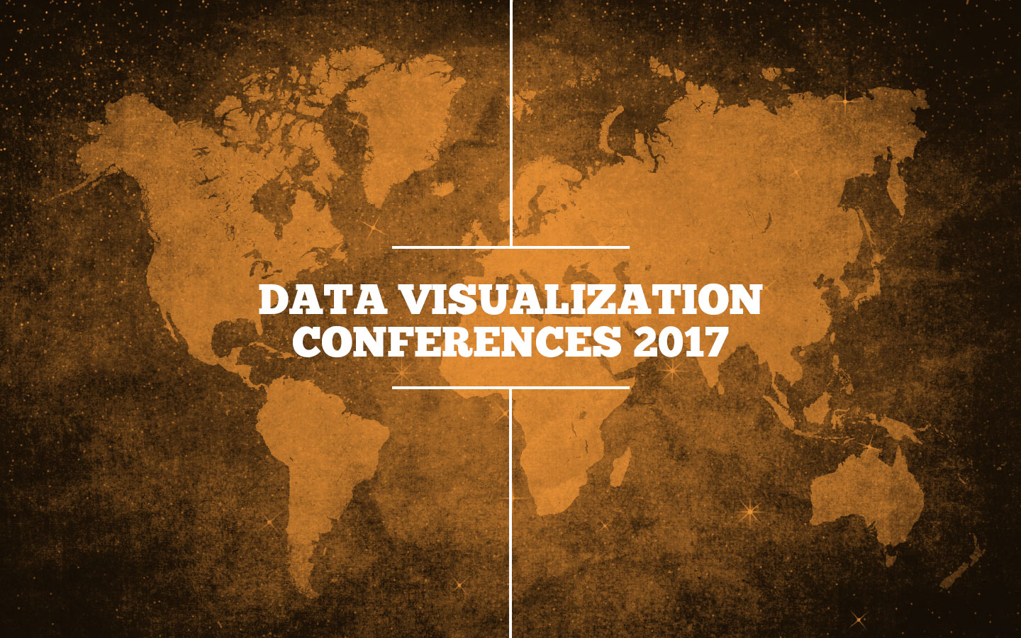
Our List of Data Visualization Conferences for 2017 With Christmas decorations now flooding department stores, we figured it was time to update our list of data visualization conferences and events

How to Tell a Story With Data Visualization Ideas and examples you can use in your organization to create a data-driven narrative The idea of collecting and storing massive amounts
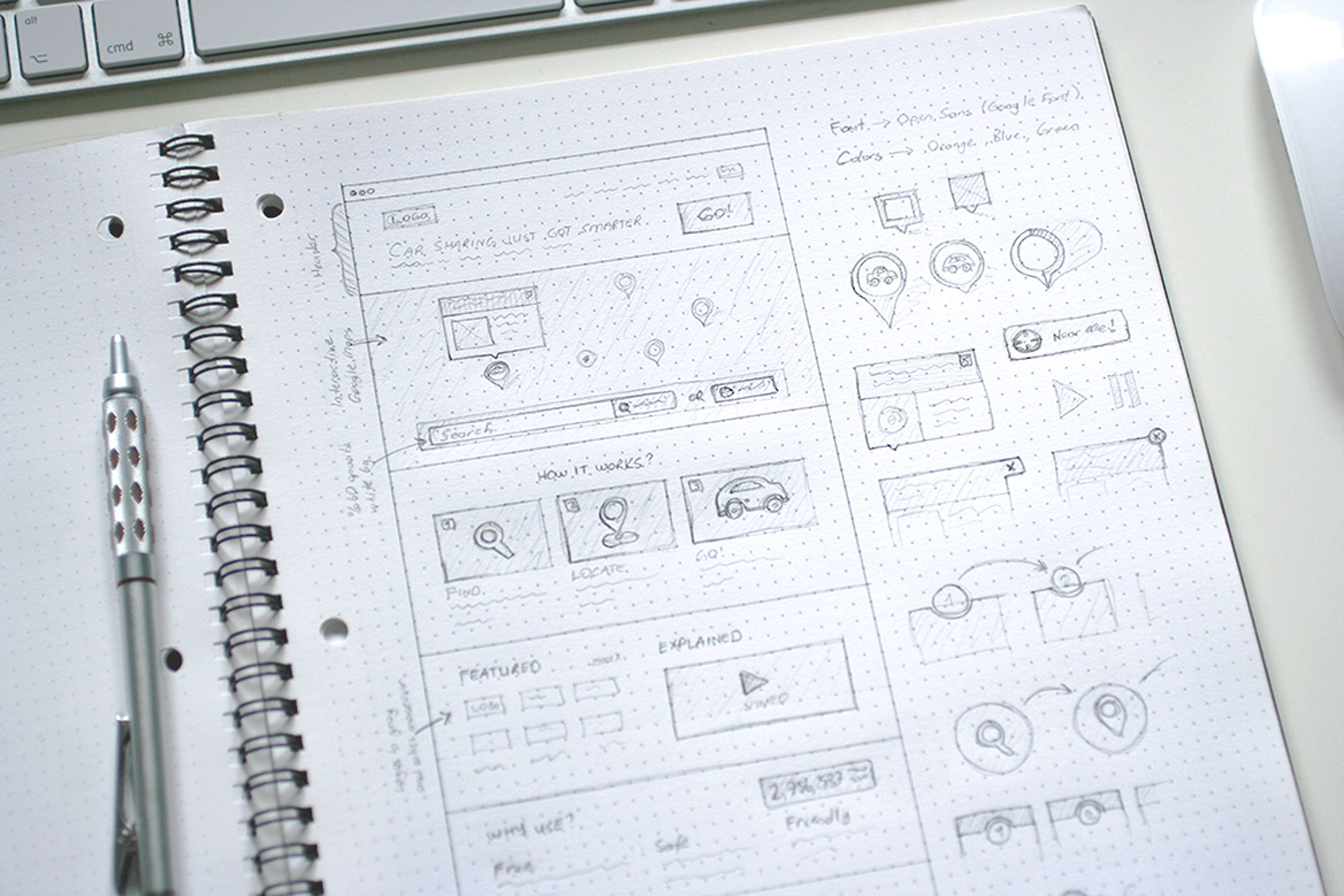
What is a microsite & what are they used for? A look at what makes a good microsite, how they differ to a website & some great examples. In previous
Data Visualization and the Big Three Strategy Consulting and Big Four Accounting Firms How does a creative data visualization and visual analytics agency get along with the ‘suits’? Combing through

Australian data visualization and analytics company, The Datalabs Agency, has announced its expansion into the U.S. market, opening an office in Los Angeles in early September. According to its Managing

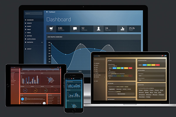
5 Tips For Designing a Great Dashboard Not all dashboards are created equal – here’s how to get it right from the designers at Datalabs. Infographic dashboards are massively useful

Telling Stories With Data: From Simplification to Persuasion and Reporting. The Most Common Questions From Our Data Visualisation Workshops. We run our Data Visualisation Workshops Australia-wide, and each session is started with
Interactive Infographic Dashboards: 5 Ways A Great Dashboard Can Optimize Your Business Operations. Business leaders employ numerous tools to track operational progress and strategically plan future campaigns. It is not

Examples of Digital Annual Reports That Don’t Suck A handful of forward-thinking companies and non-profits have begun to turn the routine production of a digital annual report into an opportunity